Sunday, April 26, 2015

Activity 9: Surveying with a Topcon Total Station and GMS-2 GPS Unit

Introduction

The last couple of weeks we have been working on two different but very similar projects. Dr. Hupy assigned us to use a couple of different pieces of technology to collect elevation data of the campus mall here on the UW-Eau Claire campus between the Davies student center and Schofield Hall. The two different equipment pieces we used were the Topcon Total Station (Figure 1) and the Topcon Tesla GPS unit (Figures 2,3,4). With both of these pieces of equipment we were to collect elevation points and create interpolated surface maps with the results of each and compare the two methods of data collection. A previous activity where we collected distance/azimuth data is a simple way to do what we are doing with these high tech units however we did not collect elevation data which is vital for creating interpolated surface maps. These high tech units increase accuracy in most cases and give you that important elevation measure at a very high accuracy. These high tech units are costly however. They are expensive costing thousands of dollars and it is very time consuming and inconvenient because of the amount of equipment you have to bring with you to conduct the survey and collect the data. The complexity of these units is much greater as well so knowing when to use them compared to just doing a simple distance/azimuth survey is important.
Figure 1 This is the total station. It is used to conduct a surface survey as it can provide distance/azimuth and elevation data with high accuracy. This is a very pricey unit with a cost of 5 to 6 thousand dollars.


Figure 2 This is the Telsa GPS survey grade unit. This is the main console with all the different programs and tools installed on it. It is both WiFi and Bluetooth enabled which is why we need a MiFi console Figure 4. This is where you create files to store the data collected.
Figure 3 This is the GPS part of the unit. This communicates with the console above through Bluetooth. This will give you 2 to 3 millimeter accuracy of the location of data points being corrected. Elevation or Z values are also very accurate when collected with this unit.


Figure 4 This is a MiFi unit. This uses a 4G cellular connection to provide WiFi signal for up to 15 devices. This is used with the Tesla unit to increase location accuracy and enable wireless data transfer.

There is alot of new technology and processes to learn for this activity and that is why we spent basically a whole class period learning from Dr. Hupy how to operate these units. Set up and use of these units is a little tricky and needs to be repeated a couple of times before the work flow becomes easier. First we started with a general overview of the units and their purpose and Dr. Hupy emphasized the importance of being careful with them and handling them with care because they are very expensive. Another key point he emphasized is the importance of making sure both the Tesla and total station are level when data is being collected. This takes time. Through adjusting the tripod legs and black knobs on the total station it is leveled and when using the Tesla just tilting the pole until the circle level is inside the ring will do the same. The total station was definitely more difficult to level off. After the units are leveled Dr. Hupy explained how to collect the data which I will explain later in the Methods section of this post. 
Each group was to collect 50 points per person with the Tesla GPS unit and as many as we saw fit with the total station. My group collected 150 with the Tesla and 50 with total station. This data was then imported into ArcMap and surface maps were created from it.

Study Area

The area Dr. Hupy wanted use to collect data in is what we refer to as the campus mall Figures 5. It is a large open area in the middle of lower campus. It is fairly flat for the most part with little elevation variation however the whole area is pitched towards the south and the Little Niagara Creek Figure 6 that runs through lower campus next to the Davies student center. This activity was delayed because of  rain and poor weather in which these units should not be used in. The days data was collected were sunny spring days in the mid to upper 60s with little wind.
Figure 5 View of the campus mall from the occupy point during our total station data collection. Schofield Hall is on the right and Davies Center is on the left with the library at the end.


Figure 6 Little Niagara Creek runs through the middle of the campus mall past Davies Center.

Methods

Total Station Collection

First step to collecting our data was check out the equipment from the Geography department here on campus. We then walked from Phillips Hall to the campus mall to set up the total station. Before the total station was put in place and leveled two points had to collected with the Tesla. These two points are called the occupy and bascksight points. The occupy point is where the total station would be set directly above and stay during the duration of the data collection. The backsight point is recorded to give the total station a zero point from which to calculate the azimuth values. This backsight point is what the total station will record as North. Once the location of these two points is recorded the total station can be setup and leveled off to start data collection. The first step in setting up the total station is opening up and tripod that the station sits on. Then the station is mounted to the top and screwed into place. Then using the built in laser on the station we made sure that the station was directly over the occupy point location collected earlier. Once this is done then the tripod legs can be pushed into the ground and the leveling processing can begin. There is a circle level on the tripod stand and the key to making sure the stand is level is to get the bubble into the center ring of the level. This is done by slowly sliding the tripod legs one at a time up or down. Once the stand is level the next step is to level the total station itself. There are two tubular levels one on each side of the unit. There are 3 black knobs on the bottom of the unit at each corner. When turned these move the unit up and down slightly allowing you to level the unit. 
Once the unit is leveled the collection can begin. The total station is connected via Bluetooth to the Tesla console (Figure 2) which caused a lot of headaches for most groups. Once connected a new job is created where the data points will be stored. In order for the collection locations to be accurate the occupy and backsight point are entered in the file setup. It also asks for a height of the station off the ground as well as the height of the reflector (Figure 7) off the ground. In our collection the total station was 1.55 meters off the ground and the reflector was 2 meters up. Making sure these heights stay consistent during data collection is vital for accurate elevation measurements. Once this is all set up point collection begins. 3 person groups are ideal for this exercise so that one person can focus the total station, one can walk with the reflector pole and one can record the points in the Tesla console. Point collection was fairly easy after setup was complete. To collect a point the person holding the reflector picks a location and then holds as still as possible facing the reflector as straight back at the total station as possible. The person at the total station then uses the top sight to find the general location of the reflector. Then looking through the scope and using the adjustment knobs to move the scope up, down, left and right the cross hairs are placed on the center point of the reflector. Once the crosshairs are locked on the person on the Tesla console taps the collect point button. The total station will then collect the azimuth, distance and elevation for that point. This process is repeated for as many points as the user desires. We collected 50 points in approximately 30. Getting the crosshairs locked in is the most difficult and time consuming part of collection but the more you do it the better you become at locating the reflector and locking on.
Figure 7 This is the reflector that the total station shoots the laser beam at to calculate distance when taking the survey. It is hard to see but there are 3 lines that intersect in the middle of the scope and that point is where you want to line up the crosshairs of the total station scope on to get an accurate reading.

Tesla GPS Collection

The data collection with the Tesla GPS unit was much simpler and quicker. The GPS unit Figure 3 is mounted on the tripod with the MiFi velcrod to the pole and console either attached to the pole or carried. The MiFi, GPS and console are all powered up. Once the console is connected to the MiFi connection the GPS can be connected to the console via Bluetooth just like with the total station. Once everything is connected the next step is to create a new file to store the collected data in. Then inside that file collection begins. In order to collect the points the tripod is leveled using the circle level attached to the tripod. Once it is level all you have to do to collect a point is tap the collect point button on the console. We did this for a 150 points throughout the mall. It took about 2 hours to collect the points just because there were so many. The setup is simple and collection is easy.

Results

Once the data was collected using each method the files were dumped onto a computer in the form of a text or .txt file. This files include the latitude, longitude, height and name of each point that was collected in the field. Once the text files are of the console they are imported into ArcMap. They show up as a bunch of points on the map but when the interpolation tool is used a surface elevation map is created in both 2D and 3D. Figures 8,9,10 and 11 below are the resulting maps from the two surveys.
Figure 8 This is the interpolation of the points collected with the Tesla GPS unit. I used the Kriging interpolation method to create this map. You can see the elevation change of the campus mall from this 2D map.

Figure 9 This is the interpolation of the points collected with the total station. I used the Kriging interpolation method to create this map. You can see the elevation change of the campus mall from this 2D map.

Figure 10 This is the 3D surface map of the campus mall collected with the Tesla GPS unit. I exaggerated it by 2 to make the elevation change more apparent because it is really hard to see using the actual elevation values. This unit captures the surface a little better probably because there are 3 times the number of points in this model than there are in the total station model.  As you can see the campus mall is a pretty flat area.


Figure 11 This is the 3D surface map of the campus mall collected with the total station. I exaggerated it by 2 to make the elevation change more apparent because it is really hard to see using the actual elevation values. This representation isn't as accurate because there are much fewer points used in this model. The weird point that is in this image is most likely where the total station was sitting while collecting this data. That point is obviously an error created by ArcScene.

Discussion

Both of these units and data collection methods are important to know how to do and very applicable in real world situations. One is obviously easier to do than the other. The total station has a much higher cost associated with it. Not only does it cost a large amount of money but the time and knowledge that is required to use is also very high. The frustration and time wasted while trying to get it all set up properly and get everything on the total station and the Tesla console to work together was a big annoyance and set back. It took us about twice as long to get everything set up and working than it did to collect our survey data. This goes back to what Dr. Hupy told us a couple of weeks ago that the more technology you are relying on the better chance that it won't work. That is why knowing how to do a distance/azimuth survey with very little technology is a good skill to have. Even when Dr.Hupy was doing demonstrations in class of how to use the units they weren't always working right. He wasn't doing anything wrong that is just what happens many times when working with high tech equipment. The biggest problem we ran into is getting the Tesla console to connect to the total station via Bluetooth. I turned them both on and off a couple of times before they finally connected to each other. Once it was connected everything went smoothly. Setting up the tripod for the total station was also a little tougher than I thought it would be. Getting it level was difficult. Overall the total station is a longer more involved and frustrating process.
Using the Tesla GPS was much easier in my opinion. Everything connected the first time we tried and with this unit one person could have collected all the data. You don't need three people. The data collection went much faster because you didn't have to find the reflector every time you collected a point. Getting the tripod level was the biggest part of the work for this method. This process can be sped up by not using two of the legs on the tripod and just using the center pole with the level on. Simply holding that middle pole and leveling it allows you to move much more quickly than trying to level out all three legs at every point. Being careful to keep the pole steady while collecting the points is the biggest concern when collecting data in this way. The Tesla GPS overall was much quicker and user friendly in my opinion there was much less equipment to bring with you, fewer moving parts, less back and forth between devices and less human input required.

Conclusion 

This semester we have now learned the low tech way (azimuth/distance) and high tech way (total station and Tesla GPS) to conduct a survey. Both ways have advantages and disadvantages and the usefulness of each is dependent on the situation. However if it is accuracy that you want which is the case most of the time I would chose the high tech method. Even though it can be more time consuming and frustrating the results tend to be much more accurate and reliable. It also provides you with elevation data without which creating surface models like we did in this activity would be much harder or even impossible. This activity taught us how to use these new technologies, work together in teams and again do some more work in a GIS sharpening those skills. Overall a good exercise it was frustrating at times but the end result that can be created from this highly accurate data what makes the activity useful.


Sunday, April 5, 2015

Activity 8:Conducting a Distance Azimuth Survey

Introduction

This week Joe Hupy gave the class the assignment conducting a survey through the use of the distance and azimuth method. The most important part of this method is finding a base point. Once you have that point it is used to map out all the features in relation of distance and azimuth to it. This is a low tech method that can be used when technology and more advanced methods fail or are not possible. This could be caused be bad weather like extreme cold or hot temps that cause the instruments to malfunction or something as simple as running out of battery. Technology does and will fail and this method gives you an easy and effective alternative. There a couple of different ways the data could be collected for this exercise. You could two separate instruments to find the distance and azimuth such as a range finder (Figure 1) and a compass (Figure 2). In our case we got to use a instrument that can do both at the same time. This was very handy and a big time saver. We used a TruPulse laser (Figure 3).

This is a Vector Optics laser range finder. By looking through the lenses and placing the crosshairs on your target it will read the distance you are from that object. (Figure 1)

This is a Suunto compass. You can find azimuth by looking through the hole on the compass and when you point it at the object you want to find the azimuth for it will display in that hole. (Figure 2)


This TruPulse laser unit will find both azimuth and distance at the same time. These are the units we used for this exercise. (Figure 3)
Joe Hupy took us outside into the Phillips Hall court yard here on campus and gave a quick demo on how to use this equipment. He then split us into our groups for the week and gave us the assignment. We were to find a study are that was 1/4 to 1 hectare in size to collect our data in. In this area we were supposed to collect at least 100 data points recording their distance, azimuth and a couple other attributes of our choice for each one. After the data is collected it will be imported back into ArcMap where it will be used to make maps of the collected points.

One thing Joe told us to consider is Magnetic Declination. It is the angle between magnetic north and the true north which changes as the earth's magnetic field varies based on location and time. I looked on line and found a website dedicated to Magnetic Declimation values based on your search location and it said that on the day our data was collected the declination for Eau Claire was one degree west. This means our recorded data will be one degree less than true north. This isn't a huge factor here in Eau Claire but in other areas of the world this declination value can be much higher.

Methods

Study Area

The first step of the assignment and data collection was to choose a study area. Our group decided that the parking lot area behind Davis Center and Phillips Hall here on campus would be a good location (Figure 4). We were interested in collecting car data so this was a very well suited location. There are lots of cars in a relatively small area making the collection of 100 points pretty easy. In order to find a base location we opened up Google Earth and looked for easily identifiable objects in the this area that would also give us a good view of the parking lot. We also found the latitude and longitude for our base locations which will be used at a later time in ArcMap when creating our maps. We determined that one of the statues behind Phillips Hall and a sewer cap down by Davis Center would be the best location for our base points. They were both raised platforms which made the cars easy to see and not only see one row but multiple rows of cars. Figures 5 and 6 are panoramic views from our two base locations.
Figure 4
The red rectangle in the image shows our study area behind Phillips Hall and the Davis Center.
 
Figure 5
Panorama view of base point 1

Figure 6
Panorama view of base point 2

Survey Process

In order to collect our data and get values for distance and azimuth that were as accurate as possible we mounted the TruPulse laser to a tripod for stability and base point location accuracy. Keeping the laser unit in the same base location while collecting data is essential to getting accurate readings. We took turns locating cars and firing the laser to gather our distance and azimuth values. The other team member was recording these reading as well as our other attributes such as car color and brand. The distance was recorded in units of meters and the azimuth was collected in decimal degrees. We gathered the data in increments of 10 to 20 cars row by row to make it easy to keep track of what cars we had done. In some cases it was difficult to get the TruPulse to get an accurate reading on the distances of the cars. Shadows and reflection from the sun were likely contributors to this problem. Keeping the TruPulse steady was difficult at times as well which also contributed to less accurate or more time consuming readings.
 

Data Entry and Mapping

All of our data points were collected in a Excel spread sheet using one of the Geography departments Microsoft Surface tablets. Having that tablet in the field was super convenient because instead of having to write down the data and later transfer it into an Excel sheet we could do all that in the field as we went. Figure 7 a and b is the resulting Excel sheet which we then imported into ArcMap.
 
Figure 7b
Figure 7a


The first step of the mapping process in ArcMap was to add a basemap. This gives us a visual reference as to where our data points were collected. For my base map I used an aerial photo in the geography departments Eau Claire County data folder (Figure 8).
Figure 8
Aerial photo from Geography GIS data folder
 
 
Next a geodatabase was created to hold all the collected field data. This is where the Excel spread sheet will be imported to. We then needed to determine the location of our too base points. In order to do so we located them on Google Earth imagery and found location one to be 44.796908 N and 91.50104 W. Location 2 was 44.796408 N and 91.49952 W  (Figure 9).
 
Figure 9
Base points for data collection
 
Once we had our base locations we then imported the Excel spread sheet. In order to do this you right click on the geodatabase and hit import and then choose the Excel file. We now need to find the location of the surveyed features so that they can be mapped. We used the Bearing Distance to Line tool in ArcMap to do so (Figure 10). The tool takes the information in the Excel and turns it into a line feature class based on the an X and Y coordinate field (Longitude and Latitudinal location in decimal degrees), a bearing field or azimuth and a distance field. Figure 11 is the resulting map from running this tool.
 
Figure 10
Bearing Distance to Line tool
Figure 11
Line feature class generated by Bearing Distance to Line tool
 
This tool does not give you the actual location of the data points collected however for that a different tool must be run. Using the Feature Vertices to Points tool (Figure 12) in ArcMap points are placed at the end of the vertices giving a point for each collected data point (Figure 13).
 
Figure 12
Figure 13
Data points generated by Vertices to Points tool
 
These are only location points however we are interested in displaying the attributes we collected for each point as well. In order to this a simple join between these surveyed points and the original Excel sheet with the attribute information in it. The join is based on the ID fields. Once these are joined we were able to display not only the locations but the attributes we collected as well. Figures 14 and 15 show the collected data points sorted by color and car brand respectively.
 
Figure 14
Map showing data points by vehicle color
Figure 15
Map showing data points by vehicle brand


Results and Discussion

For the most part our data points seem to be quite accurate and line up with the real life aerial imagery very well. There is a row of cars that seems to be slightly off the actual arrangement of the cars in the parking lot but this could be due to old aerial imagery that has different parking spaces than the current layout of the parking lot. This also could have been user error causing inaccurate distance readings with the TruPulse unit. It also could have been incorrect entry of the distance values but this seems less likely because there seems to be a pattern to the location error. If it was incorrect data entry you would expect a point that is drastically our of place and random. Making sure the base location does not change during data collection is vital. Movement from the base point between point collection will give you inaccurate readings. Like I talked about before other errors could be caused by shadows or sun reflecting off car windows which make it harder for the TruPulse to get an accurate reading.
Data collection went very smoothly for our group. We were familiar with the technology and technique we were to use and weren't really doing trial and error to find the best way to collect the data. This cut down on the time it took to collect our data and I think it also improved our data accuracy over someone who has never used this technology or method before. From reading past years blogs we could see what worked well and what didn't. From that information we made the biggest decision of where to put our base points for collection. The key to this exercise for us was the fact that our base points were elevated location that had few if any obstacles between us and the data point locations. We were able to collect our data in just over an hour which was pretty fast for the amount of points needed. If you were going to be out in the field for extended periods of time extra batteries or potable chargers for the tablet and TruPulse would be good to have. Anything you can do to cut down on the risk of technology failure is ideal.
Once we had our data collected the analysis and map creation for this exercise were fairly easy. It took about 20 minutes to run our tools in ArcMap and get the data in a displayable format. We only did 2 attributes for our points but the detail you could collect and display for each point is endless. It all depends what the purpose of the project is.
 

Conclusion

This is a low tech method of data collection. It is handy to know how to use because we all know technology fails from time to time. (Usually when we need it most.) This activity could have been done with a measuring stick and a compass, you don't need anything fancy. We were lucky using the TruPulse instead but it can be done in many other even simpler ways. The class leaned a valuable field skill that is applicable in many situations but more than that we learned the best way to do this technique and what to watch for that could reduce accuracy of your data.
 

Sunday, March 15, 2015

Activity 7: ArcPad Data Collection II: Deployment of Standardized Geodatabase ArcMap Project to ArcPad for microclimate data collection and map series production


Introduction

This weeks field activity involved the use of the geodatabase we created last week for data collection part 1. We used this database to collect data as a class and create a microclimate map of the UW- Eau Claire campus. There were seven groups of two students, each equipped with a Kestrel (Figure 1) and Juno Trimble GPS unit with ArcPad on it  (Figure 2).

This Kestrel unit was used to collect data such as humidity, dew point, temperature and wind speed/chill. (Figure 1)
This is the GPS unit we used to collect our data point coordinates. (Figure 2)

Each group of 2 students was sent out with the goal of collecting as many points as possible in a 2 hour time period. All groups collected at least 50 points with 78 being the most collected. The key to making this activity work and being able to create the final map is bringing all those collected points together into one feature class.


Study Area

Our study are for the creation of this microclimate is the campus of the University of Wisconsin - Eau Claire. We split into seven groups of two and covered both upper and lower campus. Before we went out we created suggested collection zones and sent a group to each one. Those are the red shapes in the map below. (Figure 3) When we started collecting data it was in the mid 50's with a light wind out of the southwest. It was a nice day with some sun and clouds with increasing winds as the afternoon progressed. After a while the wind got a bit chilly.

The campus here at Eau Claire has 3 main chunks, upper campus, lower campus and across the bridge and river. We sent 1 group across the river, 2 to upper campus and 4 to the lower campus portion of campus. All these areas are unique and I wondered if the physical feature differences would effect the data we collected for the micro climate map.

Here you see the UWEC campus in a satellite image. You can see the zones we laid out as well as all the location where data was collected by the groups. (Figure 3)

Methods

There were two parts to this assignment. First comes the preparation and data gathering and later the data merging and map creation.

Part 1 Prep and Gathering

The first step in creating our microclimate map was making sure our geodatabase, background imagery, and point feature class we created in activity 6 were checked out to ArcPad on the Juno GPS unit. Once we new these were ready we made a copy of the folder containing them all and pasted it to the memory card of the Juno unit.
We then grabbed our Juno and Kestrel units and headed outside to collect our data categories of surface and 2 meter temperature, dew point, wind speed/chill and humidity. We were going to collect wind direction information as well however we did not have compasses and decided as a class to not take a direction reading for each point.
Once outside we began gathering the data. This is a simple task but it needs to be done properly. We had one group member read the Kestrel unit while the other partner entered the info into the ArcPad file on the Juno unit. This process can get very monotonous and attention to detail can be lost. This is the part of the activity where the most user error could occur. If you remember from a previous activity we set domains to limit entry errors which helped me catch mistakes on a few occasions. We had to collect as fast as possible to reduce the effect of changing weather conditions as the sun went down and the temperature began to drop, effecting our data. Every group collected at least 50 points and when we were all done we had approximately 400 data points collected in roughly 2 hours. After collection we all met back in the lab to combine our collected data points.

Part 2 Data Merging

The next step was to bring all the individual group's data points together into one big feature class. Before we went to collect our data we had taken one persons geodatabase from the previous week and given it to each group to use this week so that all of the data we collected would be in the same form and easy to combine. We had points collected from all over campus and did a pretty good job of covering the areas assigned to each group. Below is the group by group data collected. (Figure 4)
Figure 4


In to be useful all this data needs to be combined into one large file. In order to do this we used the Append tool in ArcMap. Basically all you do is select each of the groups of data points and bring them into the tool. (Figure 5)You hit ok and select a save location and it combines everything into one point file that we can use to create our microclimate maps. Figure 6 is the resulting feature class of using the Append tool. Now we can make our maps.

This is the Append tool menu. Here you add you feature classes to be joined together. (Figure 5)
Figure 6
 

 Part 2 Continued Map Design

Once we have all the feature classes combined into one we could begin our map creation and analysis. In order to do this a continuous raster surface was created. I used the Kriging Interpolation method to create all of my rasters, which we used in a previous activity. The first climate factor I mapped was dew point. Dew point is one way of measuring the amount of moisture in the air. The closer this value gets to the air temperature the more moisture there is in the air. Below is the raster of the dew point data collected. (Figure 7)

From this map we can see that the dew points across campus were fairly similar with the highest values being on lower campus by the hill and next to the river. (Figure 7)

The next map I created was for another way of measuring moisture content of the air. It is a humidity map. (Figure 8) Humidity is measured as a percentage the closer to 100% it gets the better chance there is of precipitation.

We see that there is a strong correlation between the humidity values in this map and the dew point numbers of figure 7. This makes sense because the higher the dew point the higher the humidity. (Figure 8)
Temperature is another important factor we were looking at in this activity. Temperature effects most of the other factors we looked at so it is important to take into consideration when looking at microclimates. This first temperature map is of surface temperature.(Figure 9) The second map is of temperature at a height of 2 meters. (Figure 10) The last map shows the temperature with wind chill factored in. (Figure 11)

We can see there were definitely cool spots on campus when we were collecting our data. The areas in purple and blue are mostly concentrated on a north facing slope that is covered in trees, still had snow on the ground and was in the shade. It makes sense that this area is cooler than the areas of oranges and reds which are more open spaces. (Figure 9)
Looking at the 2 meter temperature map we notice that pretty much across the board the areas have increased slightly in temperature. The biggest difference is in the hill region. Getting the Kestrel up away from the snow pack can have an impact on the temperature and it obviously did the day this data was collected.(Figure 10)
Wind chill wasn't too much of a factor when we collected our data because it was in the mid to upper 50's. On days when the air temp is around freezing or lower wind chill has a huge impact on temperature. Wind chill is a calculation of the air temperature and the wind speed and is only applicable in a certain range of air temperatures.   11)

Wind is another important factor in climate. It was definitely a factor when we were collecting data. The wind was predominantly coming out of the west southwest. If we would have had compasses we would have used wind azimuth to collect wind direction data. This first map is just showing the wind speeds across campus.(Figure 12) The second shows the wind speed and the wind direction in arrows. (Figure 13).

Looking at this wind speed map we can see that flat open areas tend to be more windy than hilly areas. Upper campus, in the blue, which is flat and very open has the highest wind speeds. The areas in yellow at the bottom of the hill making it more sheltered and lower wind speeds.(Figure 12)
The arrows show the predominant southwesterly wind direction and they are colored for different wind speeds. Again as in the map above we see the low wind speeds at the foot of the hill and higher values on upper campus in flat open areas. (Figure 13)

Discussion

This activity exercised and taught us many skills that should be common knowledge for a geographer. Learning how to use the technology components like ArcMap, ArcPad, Juno GPS units and the Kestrel weather unit is very valuable. Most if not all of the class will use these tools again at some point in the future whether it be for another class of in a job setting they will be familiar with the technology. The troubleshooting and problem solving aspect of the activity is valuable as well. We all know that technology does not always work in the way we expect of want and knowing how to fix those problems is good for building patience and forces you to think outside the box. Communication and team work were also skills used in this activity. We relied on each group to go out and collect data so that we all could complete this assignment and we had to assign groups to certain areas to make sure we covered the needed areas. All these skills will be useful in the future and this is the environment to practice and improve them.

The most important point I am taking away from this activity is that it is essential to plan ahead before doing any kind of field work. If we had not all used the same attributes in our feature classes when we came back and tried to combine the data is would have been a disaster! This planning again increases communication between the groups. We had to come up with standard procedure for how to collect and store the data. It was more work up front but the amount of time it saved us when merging the dating makes it worth the effort. Having assigned areas to collect data in helped to get a better covering of the parts of campus. If everyone had just gone out and collected points in random places the distribution would not have been good which makes the creation of a good map and data representation much harder. To increase the quality of data collection a grid system could be used in the future to assure better spacing of points which would give you a better representation in the map.

Time and temperature change are things that need to be considered when created a climate map like we did in this activity. Fortunately for us the weather was pretty constant and no fronts moved through data collection. If a front would have come through the data readings would probably have been much different before and after giving you a false representation of the actual micro climate of an area. We did have to deal with time of day changing while we were collecting. We started collection in mid afternoon and were approaching sun set when we were done. The position of the sun in the sky makes a lot of difference especially when it comes to temperature. I noticed a slight cooling of temperature in the points recorded as we neared the end of collecting our data. In our case it wasn't enough to make a big difference in the microclimate representation but its should be kept in mind.

Conclusion

This activity may seem like an easy task but it should be taken seriously. There are many places in the work flow that a mistake could be made which will wreck the whole project. Attention to detail an planning ahead are the key to this being a successful activity as well as any field work. Simple tasks such as collecting points with Juno GPS or using the Kestrel get much more complicated when different groups are collaborating to come up with one single product. Communication is the best way to reduce mistakes so that everyone is on the same page. This should again be part of the preplanning.

The technical aspect to this aspect activity would be hard to teach or adequately convey to students without the hands on experience. By having to go out and collect our own data and make our own maps I think the knowledge gained was much greater than it would have been if we had just watched a demonstration of the process. Overall I though this activity went very well. The class worked well as a team with plenty of communication and pre planning leading to a successful group activity.


Sunday, March 8, 2015

Activity 6: ArcPad Data Collection I: Deployment of Geodatabase and Arc Project to ArcPad

Introduction

This weeks field activity was all about using the Trimble Juno GPS (Figure 1) units to collect points of interest to look at different microclimate factors. We focused on collecting point s on lower campus this week. Next week we will be creating a microclimate map of the entire campus. We will be going out in groups of two one GPS per group. We will also be using Kestrel units (Figure 2) to collect the microclimate factors such as humidity, temperature, dupoint, wind speed, wind chill and wind direction. We had to go out and take all the points in the same day so that all the conditions were relatively the same.

Figure 1
Figure 2


Methods

Before we went out into the field we had to finish cleaning up our geodatabases and deploy them to the Juno units for use in ArcPad. The first step was to change the symbology of the features to something that is easily recognizable when we are out collecting the data. I chose bright colored circles that stand out on the map. Another thing we did is add a background map this can used for spatial reference of where we were on campus when point was collected. Once we have our ArcPad file ready to go the next step is putting onto the GPS unit. The first step is to go the extensions tab in ArcMap and turn on ArcPad Data Manager and add the ArcPad tool bar to the window. Then click the first button on the toolbar which is the Get Data for ArcPad button. This opens a wizard. Click
next. Click on the Action Menu again and choose Checkout all Geodatabase layers then specify the folder name that it will create. Change the path to your folder. In the select deployment options window click on create the ArcPad data on this computer now. Then click finish. Once this folder is created we are ready to put it on the Juno unit. First connect the Juno to the computer via USB. Open the Juno menu and copy and paste your folder to the SD card of the unit. You are now ready to collect data.
Once this is ready collecting data is easy. We walked around campus stopping every once in a while to collect a point. The unit collects the GPS location and then we can enter the information for the microclimate which you collect with Kestrel unit. Once all of our data points were collected we plugged the Junos back in and simply copied the data file back to our folder.

Results

Below are the resulting maps corresponding to each microclimate factor. (Figure 3-9) In order to make each map I just went in and changed the field to display.


Figure 3
This map shows the wind speed at the 15 points I collected.

Figure 4
This map shows the temperature at a 2 meter height.

Figure 5
This map shows the dupoint values across campus.

Figure 6
This map shows the humidity values.

Figure 7
This map shows the temperature at the surface.

Figure 8
This map shows the different land cover types where the data points were collected.


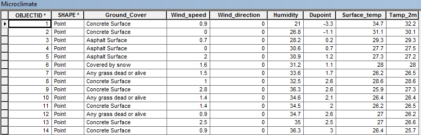
Figure 9
This is the attribute table showing all the different data fields for each point collected.


Conclusion

For me this activity went really well. Putting in the time last week to make sure my geodatabase was designed correctly definitely made collecting the data this week go much smoother. I forgot to put a couple factors into my geodatabase but next week we will all have the same databases to work out of. Pre planning and preparation made this weeks activity much easier for sure. When it comes to the data I collected it is interesting to see the variance in temperature and other factors across campus. This week was only on lower campus, so I think there will even bigger differences when we collect points on both upper and lower campus.

Sunday, March 1, 2015

Activity 5: Microclimate Geodatabase Construction for deployment to ArcPad

Introduction

This week the class was given the task of creating a geodatabase which will be used with ArcPad in the next week or so. This geodatabase is where we will store our points and information for a microclimate map here on campus. Create a geodatabase can a be a easy task if using ArcMap and ArcCatolog but if you want to do it correctly to make data analysis easier it becomes much more in-depth and difficult. This whole activity is in preparation for a future field activity, the better a this activity goes and the more time and attention to detail is used the easier the future field activity part of the exercise will be. One of the biggest parts of field work is the pre-planning,which is what this exercise focuses on. In part one we explain the reasoning behind a geodatabase and part two the actual construction of one.

Part 1

Before going out into to the field the first that needs to be done is preplanning to make sure you have the proper tools and equipment. Just going into the field with no preparation will never end well. A tool that we will be using in the field to create out microclimate map is a Juno GPS unit ( Figure 1). This unit has ArcMap on it which allows us to upload our geodatabase we created and directly edit and add data such as point, line and polygon features to the geodatabase.
Figure 1
This Trimble Juno GPS unit is what we will be using in the field to collect our data points. Using ArcMap on the Juno and importing our created geodatbases we will collect GPS points.


First before we can upload the geodatabase to the Juno unit we have to create the geodatabase. A geodatabase is a common data storage and management framework in connection with ArcGIS. It is basically a big storage bin for your GIS data where you can easily access and edit the data. The creation of a geodatabase that is designed specifically for a field task such a creating a microclimate map is a time intensive process which requires a lot of thought about what exactly you will be doing in the field and what data you will be collecting. Below you can see the steps that ESRI the creators of ArcGIS suggest when creating a geodatabase (Figure 2). As you can see there are many things to consider.
Figure 2
Suggested steps for database creation from ESRI. All of these should be considered when preplanning for a field mission and creating your geodatabase.


One of the most important aspects of geodatabase design are Domains. ArcHelp gives a very good definition of what these domains are. "Domains are rules that describe the legal values of a field type, providing a method for enforcing data integrity. Attribute domains are used to constrain the values allowed in any particular attribute for a table or feature class. If the features in a feature class or nonspatial objects in a table have been grouped into subtypes, different attribute domains can be assigned to each of the subtypes. A domain is a declaration of acceptable attribute values. Whenever a domain is associated with an attribute field, only the values within that domain are valid for the field. In other words, the field will not accept a value that is not in that domain". To sum up that definition, we use domains to limit what values can be entered for a certain feature which helps to keep the data accurate and cuts down on data entry errors. Take a temperature data set for example. When creating the domain you would set a temperature range of -20 to 100 degrees. If by accident you enter a value outside this range like 1,000 it will not accept the value and ask you to enter an new value. This helps keep the data in reasonable range eliminating outliers or very extreme values that will skew your data.
When creating domains you have a variety of different fields you can sign. These include: short integer, long integer, float, double, text, and date. Below is some explanation of these fields provided by ArcHelp (Figure 3).


Figure 3
These are a few of the field type options for domains. Short integer and float are typically the most popular options. They respectively  allow for either whole number values or fractional values to be entered. These two types as well as text will be used in this assignment. Text lets you enter words such as grass or asphalt for land cover values.

Part 2

For this second part of the exercise I will be showing you how to create a geodatabase and also set domains to customize the database for the specific field work task. There a multiple steps to this process. They are as follows:
1. Preplanning for geodatabase creation and field data collection
2. Creation of a new geodatabase
3.  Setting of domains based on preplanning info
4. Creation of the feature class that will be used to collect data
5. Import the project into ArcMap

Step one is all about thinking about the project at hand. We are creating a microclimate map. A microclimate is a small area that is different from the are surrounding it based on factors like temperature and humidity. These areas can be small like the courtyard area in Philips which is typically warmer and less windy than the areas around the outside of Phillips hall. A large microclimate would be a city where the temperature is usually more moderate and doesn't experience bitter cold like rural areas do.

In order to create a microclimate map many factors need to be taken into consideration. In our case will be looking at temperature (ground level and at 2 meter height), wind speed, wind direction, relative humidity, dew point, and land cover type. All this data will be collected here on the UWEC campus and from which we will create our microclimate map.

For steps 2- 4 I will walk you through step by step in the tutorial below.


Conclusion

Creating a geodatabase itself is not a very challenging task however, paying close attention to detail is the challenging part. If this is not done correctly work in the field will not be successful. This is all part of preplanning for a field mission. If everything has been planned out well before the field portion begins, data collection can and should go smoothly. We will see how well I planned ahead in the design of my geodatabase when we go out to collect data in the next couple of weeks.