Sunday, February 15, 2015

Activity 3: Development of a Field Navigation Map and Learning distance/bearing Navigation

Introduction

This weeks field activity involved the creation of two navigation maps in preparation for a navigation activity out at the UWEC Priory in a couple of week when the snow is hopefully gone. We also learned how to measure our pace count which will also be used in the navigation exercise.

A pace count is how many steps one takes in order to cover a set distance. In our case that distance was 100 meters. A pace is every time the foot the person steps with first hits the ground. So if they start with the right foot, every time that foot hits the ground that is one pace. In order to find the pace count we went outside and measured off a 100 meter distance with laser measurement devices, but you could also do this with a tape measure or other low tech equipment. We then walked the 100 meters and counted our paces. Each person did it twice to get a more accurate pace number. Pace numbers varied from 58 to 75 or so which is caused by the height and stride length differences of each person. I got a pace count of 58.  When on smooth terrain using the straight up pace count is adequate but when in rough hilly terrain 2 to 3 paces should be added for every pace because in most cases rough terrain causes stride lengths to get shorter. Knowing your pace count while navigating helps you to estimate your position on a map based on paces from certain objects or land forms.

Methods

We were asked to create two separate navigation maps for this exercise. Both over the same navigation area, set by Joseph Hupy,of the Priory. One map had to have a grid system using Universal Transverse Mercator (UTM), the other map was to use decimal degrees of latitude and longitude.

The first map created was in a UTM coordinate system. UTM uses a two dimensional coordinate system to assign location points to the earths surface. This system uses 60 different zones, each of which is 6 degrees wide in longitude. In each zone a secant transverse mercator projection is used.


The image shows the layout of the UTM zones on the surface of the earth. They are divided into northern and southern zones and each contain 6 degrees of longitude. Eau Claire Wisconsin is contained by UTM Zone 15N. (Figure 1)

The second map was to use the World Geodetic System (WGS) which is based on decimal degrees of latitude and longitude. This system is widely used for GPS and cartography purposes.

The WGS uses longitude and latitude lines on the earths surface to assign location points. (Figure 2)  
In ArcMap our maps are to be laid out in 11x17 landscape format. In order to do this click file, page and print setup, click landscape and switch the page size to 11 x 17. After I created a new geodatabase the next step was to bring in a  Digital Elevation Model, base map, and navigation boundary or whatever data we felt is necessary to create an effective navigation map. This data was found in Joe's data folder. For my map I used a 5 Meter Digital Elevation Model (Figure 3), 5 Meter contour lines (Figure 4), a base map of the area, and the point boundary (Figure 5).


This is the DEM of the navigation area of the Priory. Areas in red are higher elevation and as they get lower they turn more green. This image allows us to visualize the elevation changes on the Priory property which we can take into consideration when navigating and taking a pace count.(Figure 3)
This is the contour line feature that was created through use of the Surface Contour tool in ArcMap using the above DEM. These are 5 meter intervals. I chose the 5 meter interval to still get a good idea of the elevation change but keep the map clean and useable. I also added labels to the contours for reference. (Figure 4)
This is an aerial image of the Priory on the outside of Eau Claire where we will be navigating in the future with the maps created today. This Aerial image is available through the US Geologic Survey. The red rectangle is the point boundary within which the navigation points will be. (Figure 5)
I brought all these components together into a map. The base map is the very bottom layer on top of which I placed the 5 meter DEM. To still be able to see the base map I turned the DEM opacity to 70 percent so it is washed out and the base map shows through. I then added the 5 meter contour lines on top of those layers with the point boundary as well. Over top of all these layers is the grid system for each map. Once I had these map components chosen and like how my map looked, in that it wasn't too cluttered but also has adequate information included, the next step was to project the map. For the first map which uses the UTM grid I used NAD 1983 UTM Zone 15N. Eau Claire is contained in this UTM zone and because of this there is less distortion in the map which is very important when using the map for navigation purposes. For the second map I used GCS NAD 1983 (2011). This coordinate system is based off degrees latitude and longitude.

Once my maps were projected the final step was to insert a grid on each one. This is a fairly easy process which I  repeated for each map.

Step 1. With the map in layout view right click on the data frame Layers and select Properties from the drop down.


Step 2. In the properties box click on the Grids tab. You then want to select New Grid. This will open a new window where you can select what type of grid you want. (Graticule, Measured, or Reference.)

Step 3. For my first map I selected Measured. The second map I chose Graticule.


Step 4. When you click measured you see the window below in which I entered 50 for the x and y axes and made sure the UTM zone 15N coordinate system was selected. Hit Next.


When you click graticule the window below pops up in which the seconds column should be changed from 30 to 2. Hit Next.

Step 5. For both maps click Next on the Axes and Labels window.


Step 6. Click Finish on the Create Grid window below.

Step 7. Once the grids are created you can select which one you like and add it to the map. This is also the place to adjust the properties of the grid until it looks how you like. Select the grid you want to use and click Apply then OK and it will be added to the map.

Results

After completing the steps above to create the grids and also doing some cartographic designing the maps below are my final products. The first with measured 50 by 50 meter grid system using UTM Zone 15 N. The other with a craticule grid of 2 seconds using GCS NAD 1983 (2011).

UTM based grid navigation map. (Figure 6)
 

Degrees longitude and latitude navigation map. (Figure 7)

Discussion

These two maps are similar but are completely different in the way they use different coordinate systems. This difference will have an impact on how navigation is done using each map. Both maps are equipped with the necessities of navigation maps. Both have aerial imagery which can be used to find land reference points and land marks, a DEM to get a idea of the general lay of the land, contour lines to give more detail of elevation when needed, and a coordinate system which allows the user to create point locations and judge distance.

 I have a feeling that one of these maps will be easier to navigate with but that will be determined when we do that exercise. The UTM map is measured in increments of 50 meters which makes determining distances very easy and the image should not be very distorted because Eau Claire is fully in Zone 15N of the UTM grid. I think the GCS grid will be more difficult to use but again we will have to wait and see.


Conclusion

Most people are used to using GPS units and other electronics to navigate now a days, however knowing how to navigate from a map is a very important skill to posses. Through the use of pace counts, the grid systems on the maps and a compass a person with proper knowledge should be able to navigate without any electronic devices. Now that we have created our navigation maps, know and understand a lot of the concepts that go into creating a good navigation map the navigation exercise at the Priory in a couple of weeks should go fairly smoothly, however there is always the chance of someone getting lost. We will be able compare what parts of the maps worked well or didn't work so well for future reference and a better understanding, if we ever make another navigation map.


Sources

Aerial Image - USGS
5 Meter DEM- USGS
5 Meter Contour  - USGS DEM
Point Bounday - Created by Professor Joseph Hupy

Sunday, February 8, 2015

Activity 2: Visualizing and refining your terrain survey


Introduction

This week we followed up and expanded up on the exercise from week one where we created a model terrain in the planter boxes in the garden area of Philips hall. As directed by professor Hupy we took our xyz coordinate excel data sheet from the first exercise and brought into ArcMap where we created a data set from it. We then looked at 5 different terrain modeling techniques which included IDW, Natural Neighbors, Kriging, Spline, and TIN. The data set was put into each of these tools which creates a 2D image of the terrain. Then to take an even closer look and get a real 3D image of our model terrain we placed the 2D image into ArcScene. Once we looked at the 3D images we could decide which of the techniques made the most accurate representation of our model terrain. We could also tell the areas in the model that we needed to premeasure and add more data points to.
This assignment was much more computer intensive than the first and less hands on however the results of this exercise really allowed use to visualize our model terrain.

Methods

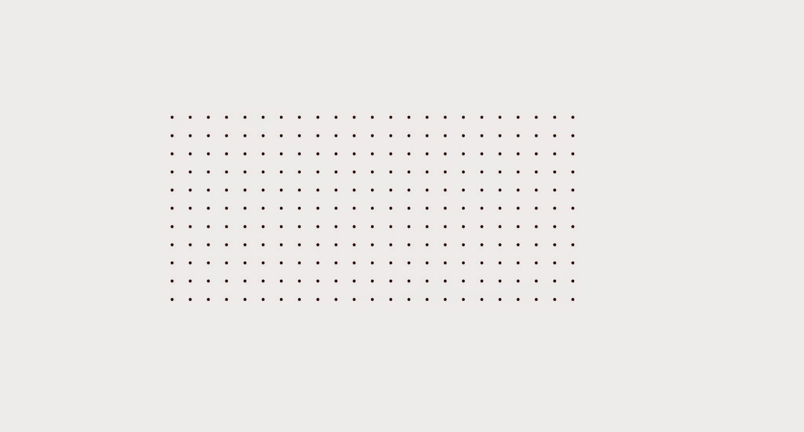
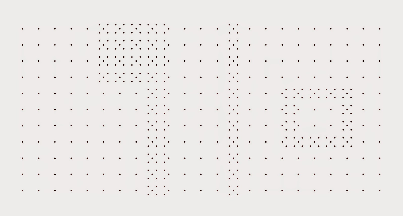
The first step in this exercise is to bring the XYZ data table into ArcMap. Once the table is in ArcMap a feature class was created and the below image is what results. It may appear that this is a 2D XY point grid however there are Z values attached to each point that have a height value assigned to them which gives it the 3D attribute.


This is the resulting feature class when the XYZ data table is brought into ArcMap.(Figure 1)
The next step is to use each of the interpolation techniques and look at the results.


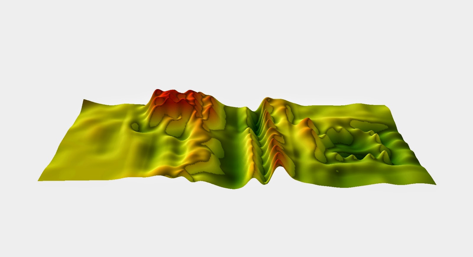
The first technique is called IDW or Inverse distance weighted interpolation. In this method the cell values are determined based on a weighted combination of sample points. It takes the average of near by cells and comes up with the cell value. The closer the sample point the more weight or effect it has on the cell value. You can adjust the sampling area how you like in this technique.
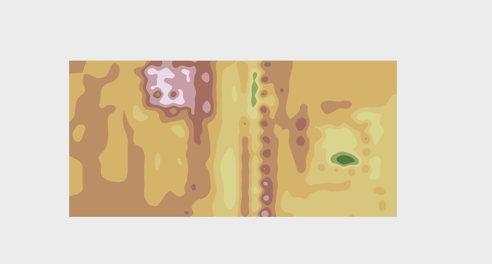
2D representation of the terrain using the IDW method (Figure 2a)

2D representation of the terrain using the IDW method (Figure 2a)

The next technique is the Natural Neighbors interpolation method. This technique is similar to the IDW method however instead of the points being weighted because of location it finds the closest subset of the input sample points in the direction of similar values. Instead of  using a cell in the IDW method it uses a query point and looks at the sample point values around that. This method is usually fairly accurate and usually does not created features that aren't part of the actual model.
2D representation of the terrain using the Nearest Neighbor method (Figure 3a)

3D representation of the terrain using the Nearest Neighbor method (Figure 3b)


Kriging, which is the next technique, assumes that the distance or direction between sample points reflects a spatial correlation that can be used to explain variation in the surface. The Kriging tool fits a mathematical function to a specified number of points, or all points within a specified radius, to determine the output value for each location. When there is a known spatially correlated distance or directional bias in the data this is a good method to use.
2D representation of the terrain using the Kriging method (Figure 4a)

3D representation of the terrain using the Kriging method (Figure 4b)


The Spline technique uses a function to make a smooth, curved surface. The surface must go through all of the sample points and has a minimum curvature value. For best results this technique should not be used with data that has large changes in clumped data.

2D representation of the terrain using the Spline Method. (Figure 5a)

 3D representation of the terrain using the Spline Method. (Figure 5b)


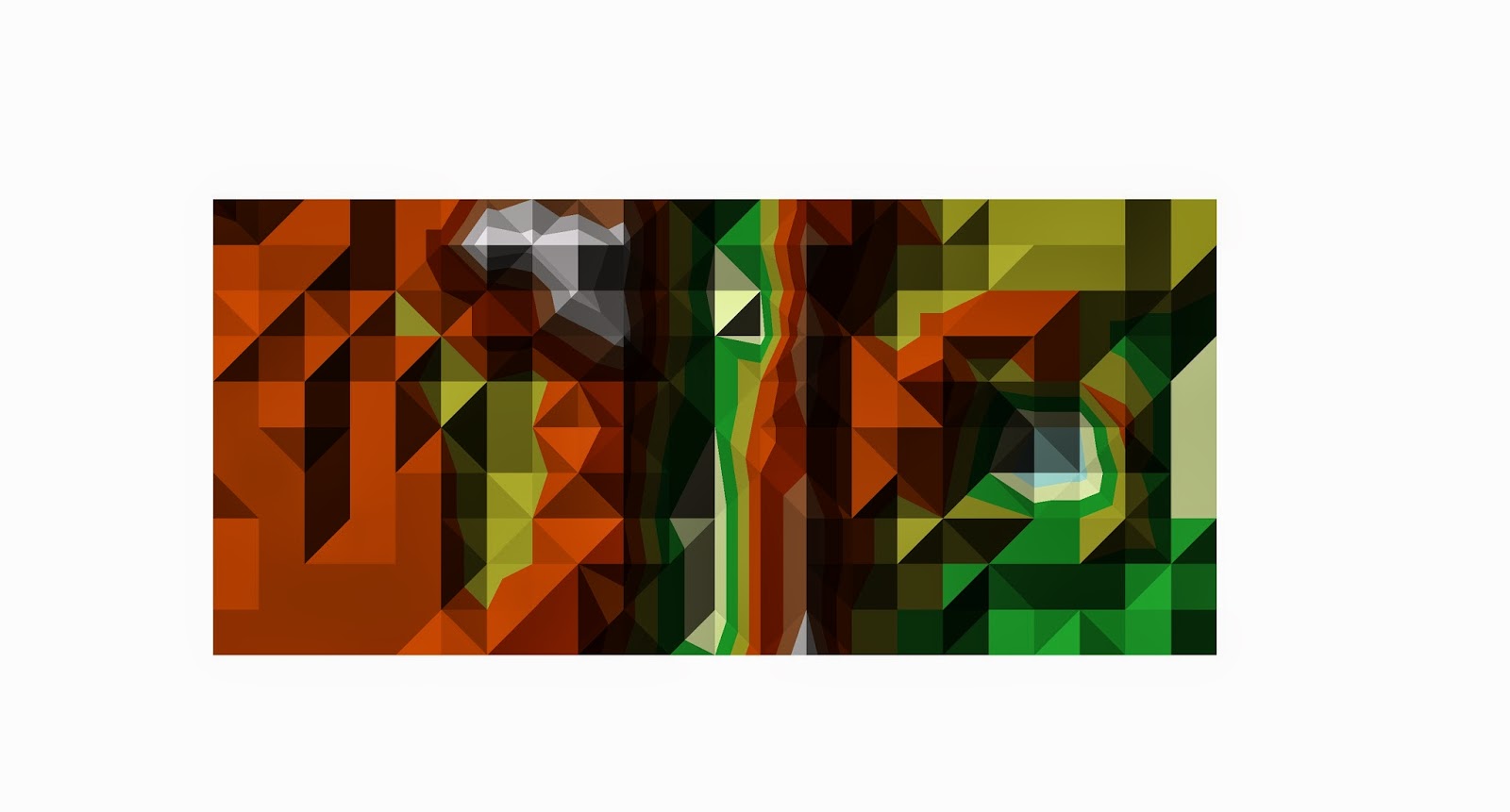
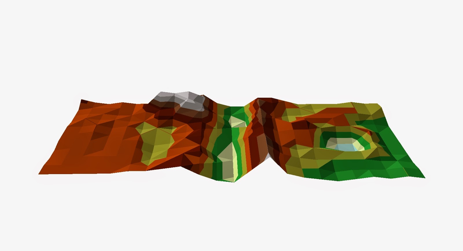
A TIN or a Triangular Irregular Network is a digital way to represent  a surface. They are created using a triangular set of vertices in a vector setting. The vertices are connected by edges which forms a network of triangles that covers the whole surface of the terrain. The more data points a TIN has to work with the better the resolution is and this typically happens on areas of large elevation change so ridgelines and river banks are usually represented very well in a TIN.
2D representation of the terrain using the TIN method. (Figure 6a)
3D representation of the terrain using the TIN method. (Figure 6b)


Overall all of these techniques did a fairly decent job of reproducing our terrain model but some obviously did it more accurately than others. After looking at all of the techniques I think it is apparent that the Kriging technique did the best reproducing our model terrain. The TIN did a pretty good job too but the small amount of data points makes the image choppy and clunky.


After looking at our results we decided as a group to go back and resample parts of our terrain to see if we could get a more accurate representation of it in ArcScene. Below is the new feature class after we collected more data points and increased our measurement frequency in areas of large elevation change like by our ridges, hill and crater.

This is our feature class after collecting more data points. (Figure 7)


Discussion

Each interpolation method had strenghts and weaknesses. We were interested in the method that most accurately displayed our data. Looking at the images of each method we got the following results. The IDW did not perform well, the surface was spiky and had unrealstic features added to it. (Figure 2b) The nearest neighbor method did much better displaying the real surface however there were still some small spike especially along the top of the ridges which it made very pointed. (Figure 3b) The Kringing method did slightly better than the nearest neighbor with very little spiking and a pretty accurate representation of the real surface.(Figure 4b) The spline method did not do well with our data. There are lots of weird spike and points all over the image and compared to the real model terrain that the spline image looks nothing like it. (Figure 5b) The 3D TIN is really accurate and compared to the other methods I think it did the best representaion of the surface with the first data set. The biggest set back with the TIN is that in order to make it look smooth and not clunky we would have to redo the data for the entire terrain adding many more data points so that it would contain many more smaller triangles which would greatly improve the smoothness of the image. (Figure 6b)
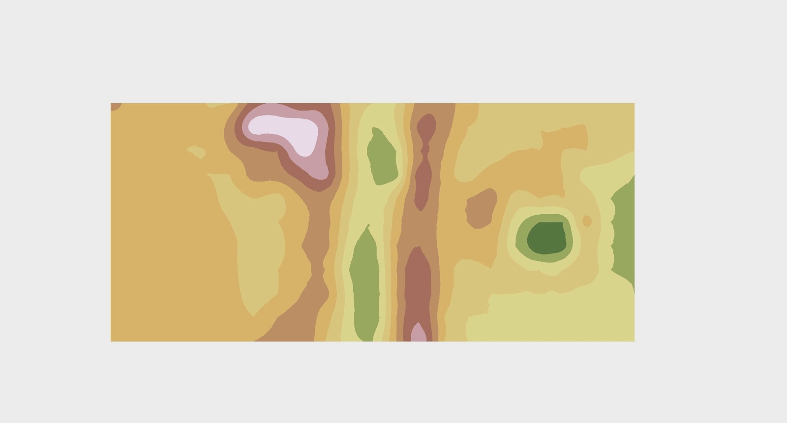
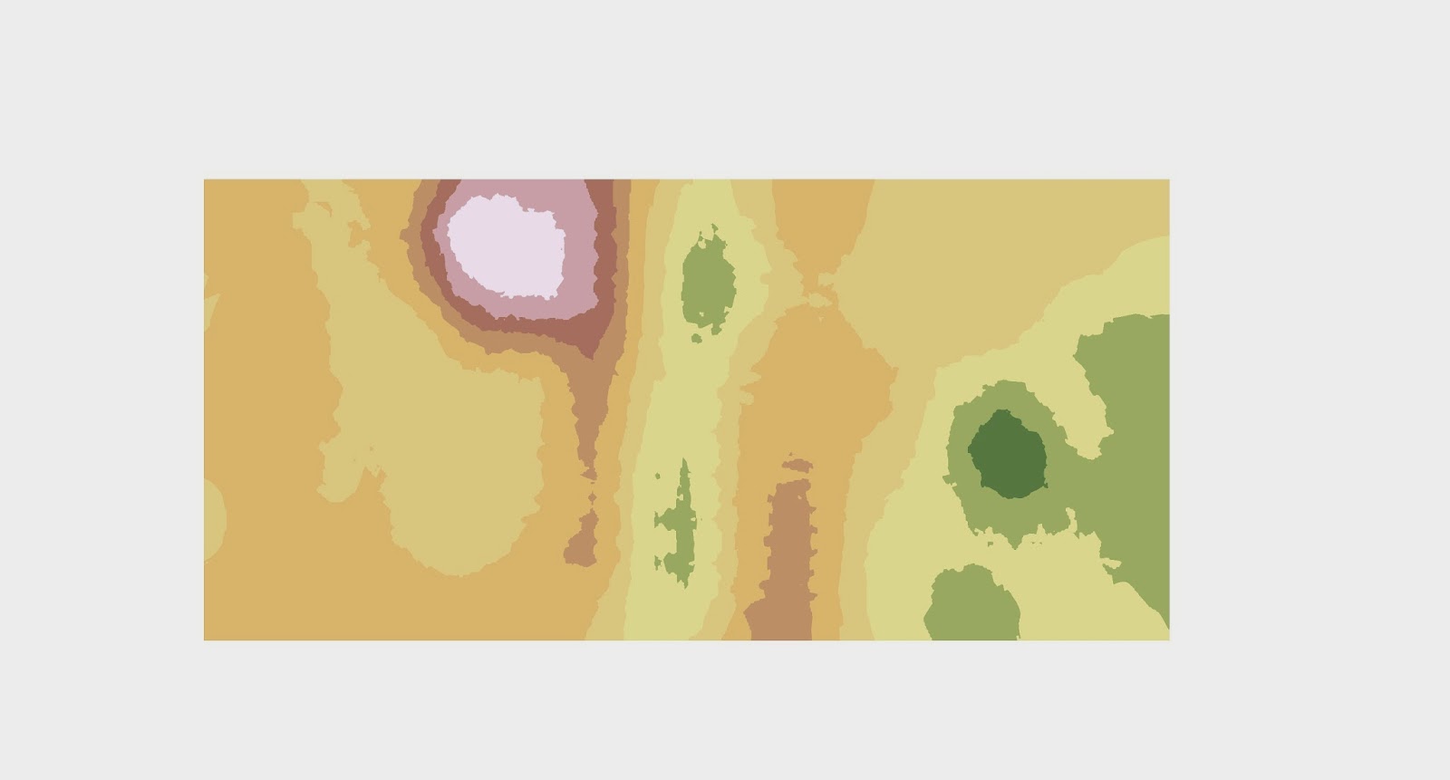
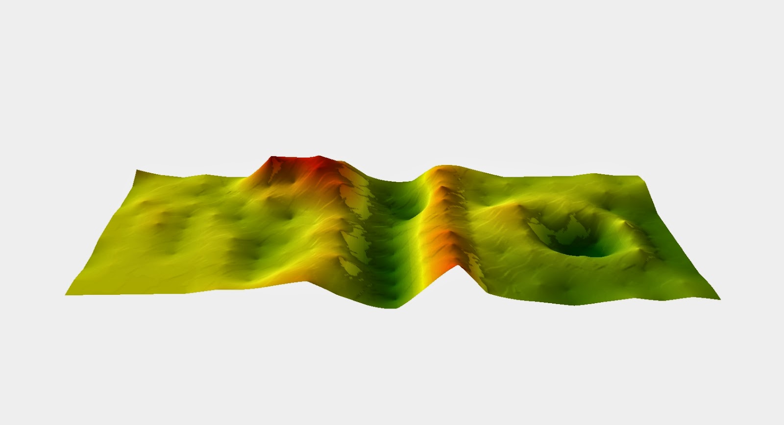
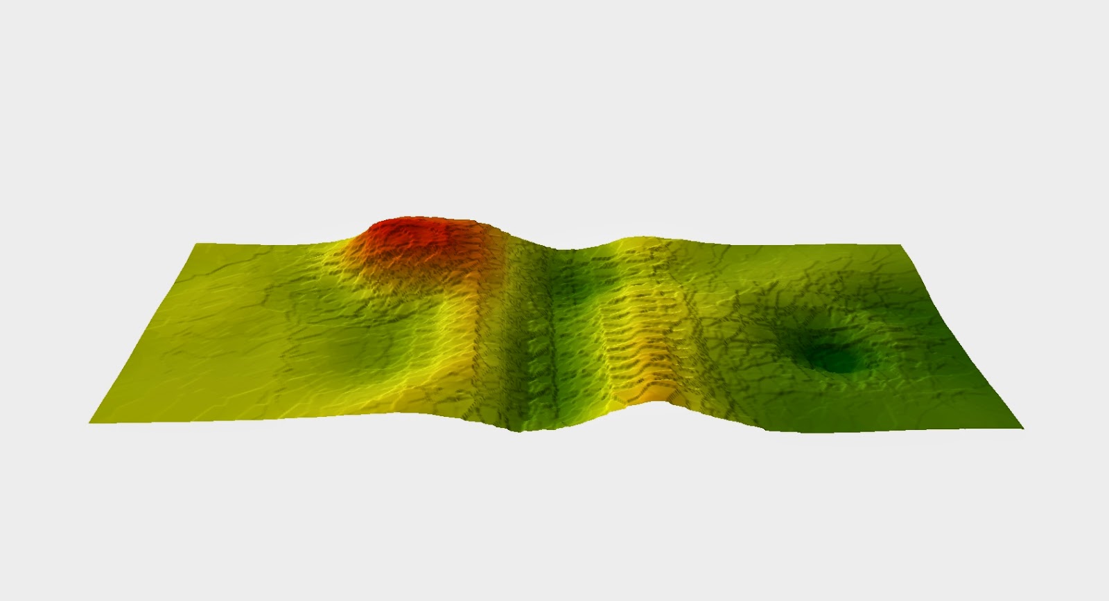
Based on the above results we decided to the use the Kriging method with our second data set. Even though the TIN did a good job of representing the surface the time it would have taken to survey our model terrain with the amount of points needed for a better TIN would have been insane. So we chose the Kriging method which also very accurately modeled the surface and we could re sample small areas to get a better image instead of the whole terrain. I think that just from looking at the results of the 2D image from the first to second time after more points were added is enough to say that adding those points definitely enhanced the final image. Knowing what our model terrain looks like I can easily pick out the features in the second image where as in the first it just looks like a bunch of different color blobs.  Looking at the 3D model you can see that the spikes and other unnatural features go away in the second image. The increase in data points helps to eliminate these computer errors and gives us a smooth realistic surface.
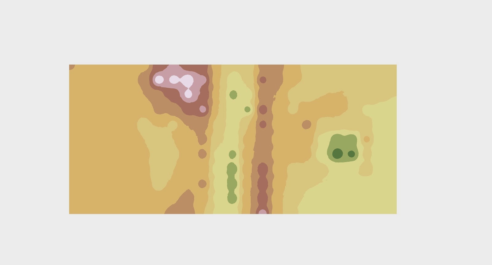
Kriging method 2D image with original data points. (Figure 8a)

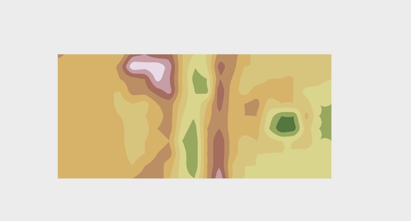
Kriging method 2D image with the expanded data points. (Figure 8b)

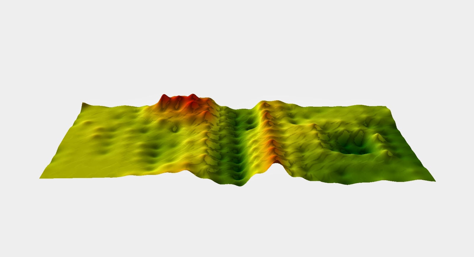
Kriging method 3D image with first data points.(Figure 9a)


Kriging method 3D image with expanded data points. (Figure 9b)


The results of our data points in our second data set may be slightly off from the first data set because it snowed a little bit on our model terrain and the sun was also shaping the model so there were some slight differences. Next time I think making our model out of dirt instead of snow would be wise and also keeping the model covered from the elements would also help preserve the shape and give us more accurate measurements. 

Conclusion

Learning different interpolation methods and hen to use them is a big take away from this activity. Having to work in a group in cold weather and hurrying to get done before it got dark and we couldn't see anything made us work together better and more quickly while still getting accurate results. This activity is very reliant on the terrain model surviving weather condition so if I did this again and I think the group would agree that we would use something other than snow to make our model out of. I think it would also be cool to survey the model through use of aerial photographs or some other survey method a little out side of the box.

Sunday, February 1, 2015

Activity 1 : Creation of a Digital Elevation Surface using critical thinking skills and improvised survey techniques

Introduction

For the first field exercise of the semester the class was asked to create model landscapes, in the planter boxes in the Phillips court yard, out of snow and soil. After the model terrain was created the next objective was to survey the terrain in whatever way the groups felt was most appropriate. Joe Hupy the instructor suggested that the groups create a grid system for point placement and elevation recordings. In order to do this we were provided with supplies such as tape, meter sticks, string and various other items. After using a grid system to create x,y position points and z values as elevation these points are then transferred into a Excel Spread Sheet for later use in terrain modeling software.Working as a group, feeding off of each others ideas and the professors suggestions were all key parts to completing this exercise.

Methods

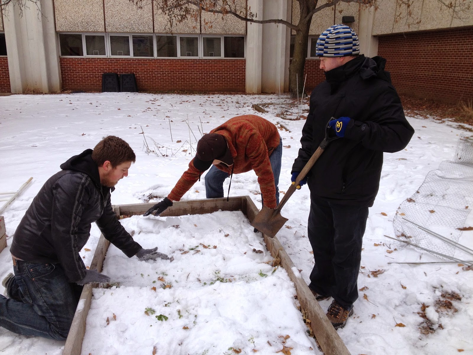
The first step in our method was to decide how we wanted to accomplish the task before us. We decided that the wooden boarder around the planter box would be our 0 elevation point on which the string grid would rest. Once we decided our 0 point we dug out and shaped the snow into our model terrain as seen in figure 1.


Creating terrain. Figure 1
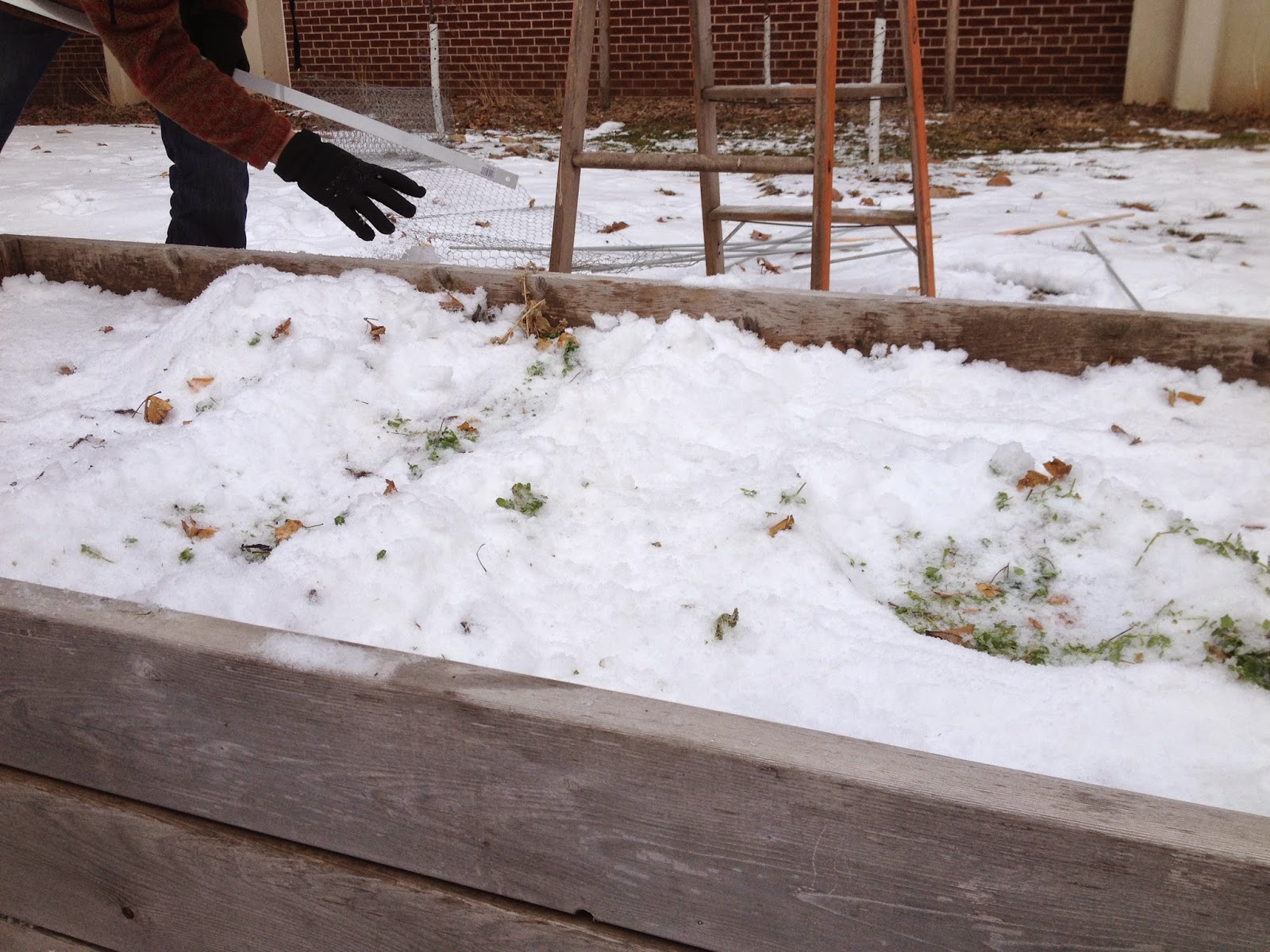
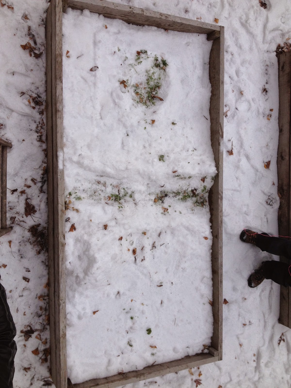
The box was formed into a series of valleys, ridges, plains and basins using our hands and a shovel. To make the surveying easier on ourselves we made sure that all of our terrain features were below the edge of the box or lower than our 0 point as you can see in figures 2 and 3.

Figure 2

Figure 3
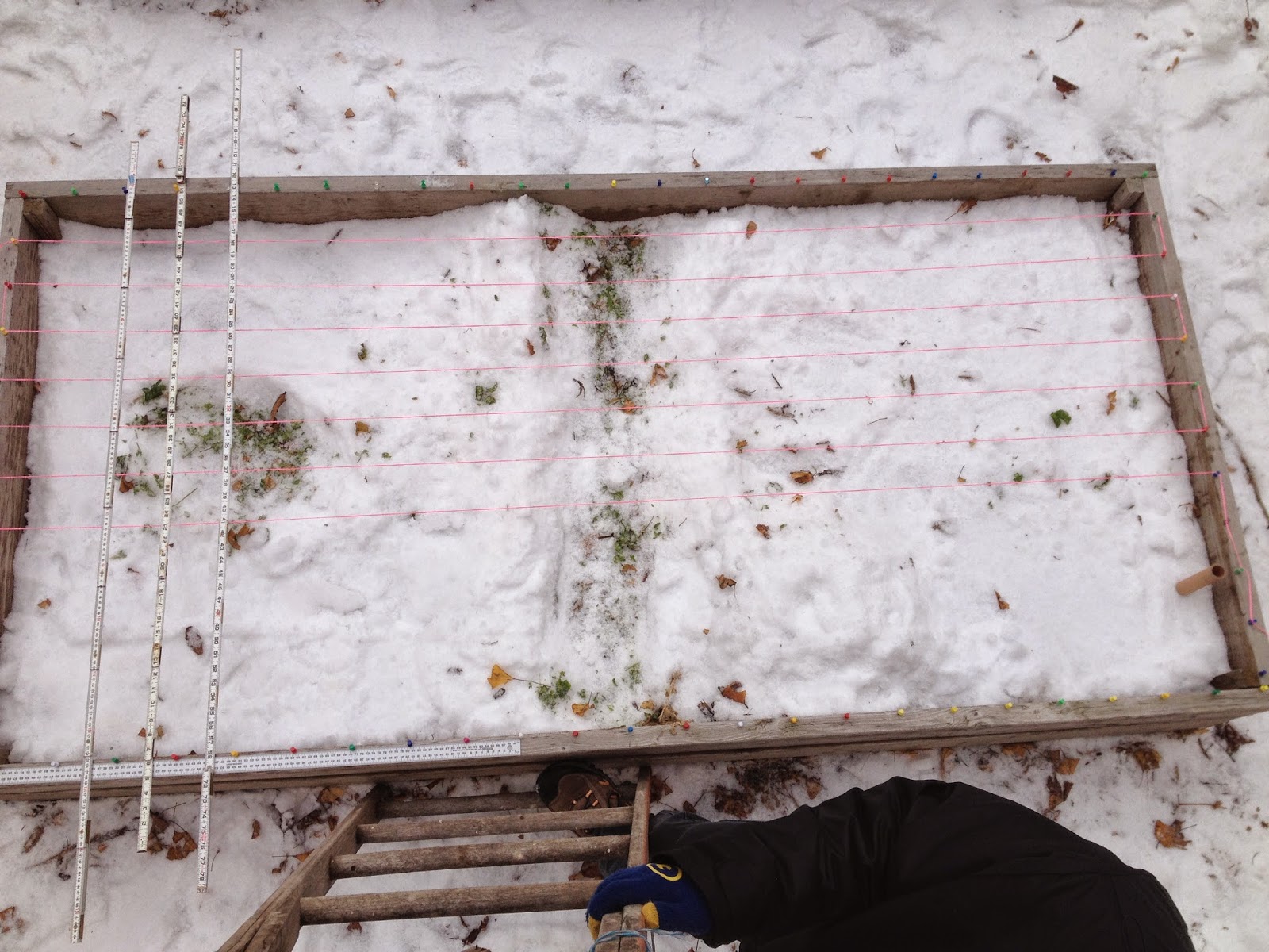
Once the terrain was complete we began to set up our grid for surveying. We used thumb tacks spaced 5 cm apart to attach the string which we ran length wise on the box. We then placed meter sticks across the width of the box to create our 10x10 cm grid pattern as seen in figure 4.

5x5 cm grid system. Figure 4
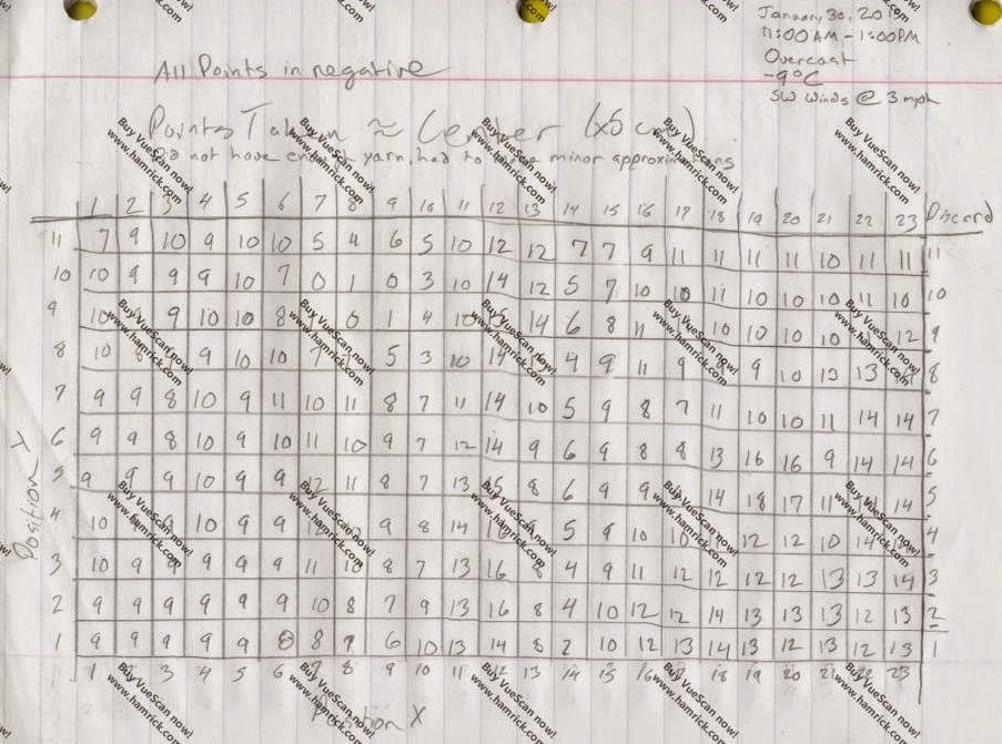
Once we had the grid set up we took depth measurements from the center of the grid squares down from our 0 point or the string height. We recorded all of these values and ended up with the chart below in figure 5. 

Field notes. Figure 5
Then to make the next step of this project easier where we have to make an electronic terrain model these points were put into an Excel Spread sheet laid out the same way as our original point chart. (Figure 6) All of our z values are negative because we were measuring down from the rim of the box and none of our model terrain came above the rim of the box. In total we ended up with 253 measurement points. Ranging from depths of 0 to 19 cm.

Excel grid points. Figure 6

Discussion

The surveying method we chose was fairly efficient and we completed the exercise in a pretty timely manner. From the beginning of or terrain shaping to measuring the last point took about an hour and a half, which I think we were all thankful for because it was rather cold outside. The accuracy of our data points is fairly high, I would say, with the possibility of some human error in the measurement method or the data transfer from paper to excel sheet. Overall though I think our methodology was very solid and I expect the electronic terrain model to show that.

Conclusion

The skills learned and used in this exercise are very applicable to real life situations when working out in the field. Being given a task with little direction on how to complete the task forced us to think out side the box, get creative, and work effectively in a group setting to complete this exercise.