Introduction
This week we followed up and expanded up on the exercise from week one where we created a model terrain in the planter boxes in the garden area of Philips hall. As directed by professor Hupy we took our xyz coordinate excel data sheet from the first exercise and brought into ArcMap where we created a data set from it. We then looked at 5 different terrain modeling techniques which included IDW, Natural Neighbors, Kriging, Spline, and TIN. The data set was put into each of these tools which creates a 2D image of the terrain. Then to take an even closer look and get a real 3D image of our model terrain we placed the 2D image into ArcScene. Once we looked at the 3D images we could decide which of the techniques made the most accurate representation of our model terrain. We could also tell the areas in the model that we needed to premeasure and add more data points to.
This assignment was much more computer intensive than the first and less hands on however the results of this exercise really allowed use to visualize our model terrain.
Methods
The first step in this exercise is to bring the XYZ data table into ArcMap. Once the table is in ArcMap a feature class was created and the below image is what results. It may appear that this is a 2D XY point grid however there are Z values attached to each point that have a height value assigned to them which gives it the 3D attribute.
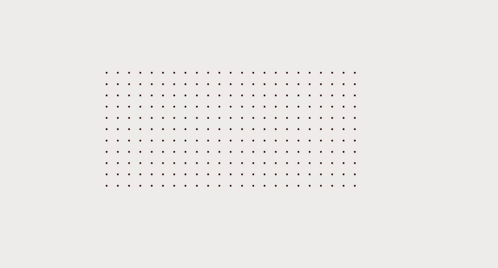 |
| This is the resulting feature class when the XYZ data table is brought into ArcMap.(Figure 1) |
The next step is to use each of the interpolation techniques and look at the results.
The first technique is called IDW or Inverse distance weighted interpolation. In this method the cell values are determined based on a weighted combination of sample points. It takes the average of near by cells and comes up with the cell value. The closer the sample point the more weight or effect it has on the cell value. You can adjust the sampling area how you like in this technique.
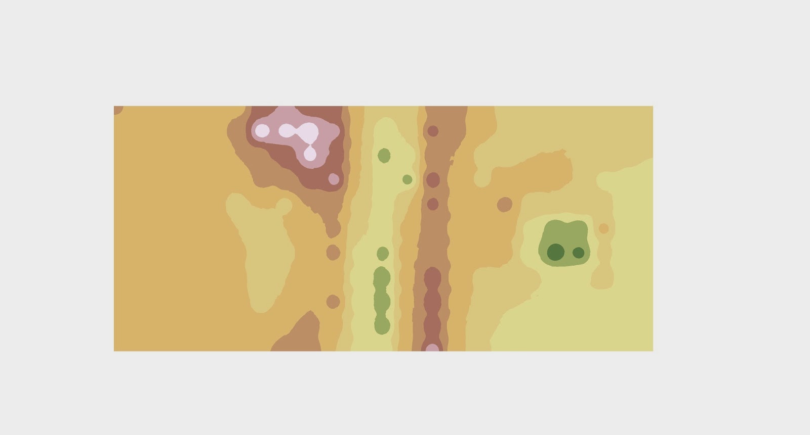 |
| 2D representation of the terrain using the IDW method (Figure 2a) |
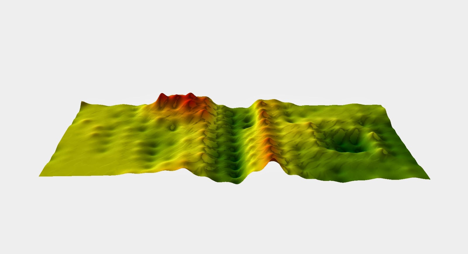 |
| 2D representation of the terrain using the IDW method (Figure 2a) |
The next technique is the Natural Neighbors interpolation method. This technique is similar to the IDW method however instead of the points being weighted because of location it finds the closest subset of the input sample points in the direction of similar values. Instead of using a cell in the IDW method it uses a query point and looks at the sample point values around that. This method is usually fairly accurate and usually does not created features that aren't part of the actual model.
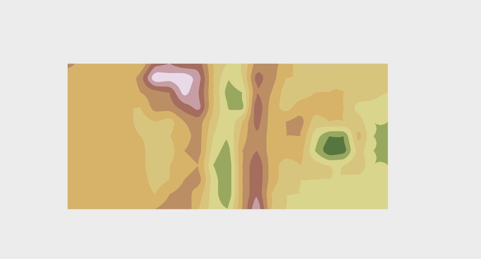 |
| 2D representation of the terrain using the Nearest Neighbor method (Figure 3a) |
 |
| 3D representation of the terrain using the Nearest Neighbor method (Figure 3b) |
Kriging, which is the next technique, assumes that the distance or direction between sample points reflects a spatial correlation that can be used to explain variation in the surface. The Kriging tool fits a mathematical function to a specified number of points, or all points within a specified radius, to determine the output value for each location. When there is a known spatially correlated distance or directional bias in the data this is a good method to use.
 |
| 2D representation of the terrain using the Kriging method (Figure 4a) |
 |
| 3D representation of the terrain using the Kriging method (Figure 4b) |
The Spline technique uses a function to make a smooth, curved surface. The surface must go through all of the sample points and has a minimum curvature value. For best results this technique should not be used with data that has large changes in clumped data.
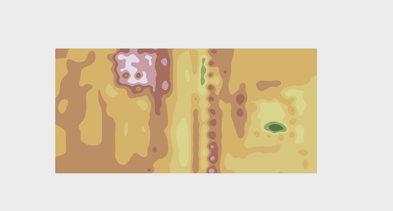 |
| 2D representation of the terrain using the Spline Method. (Figure 5a) |
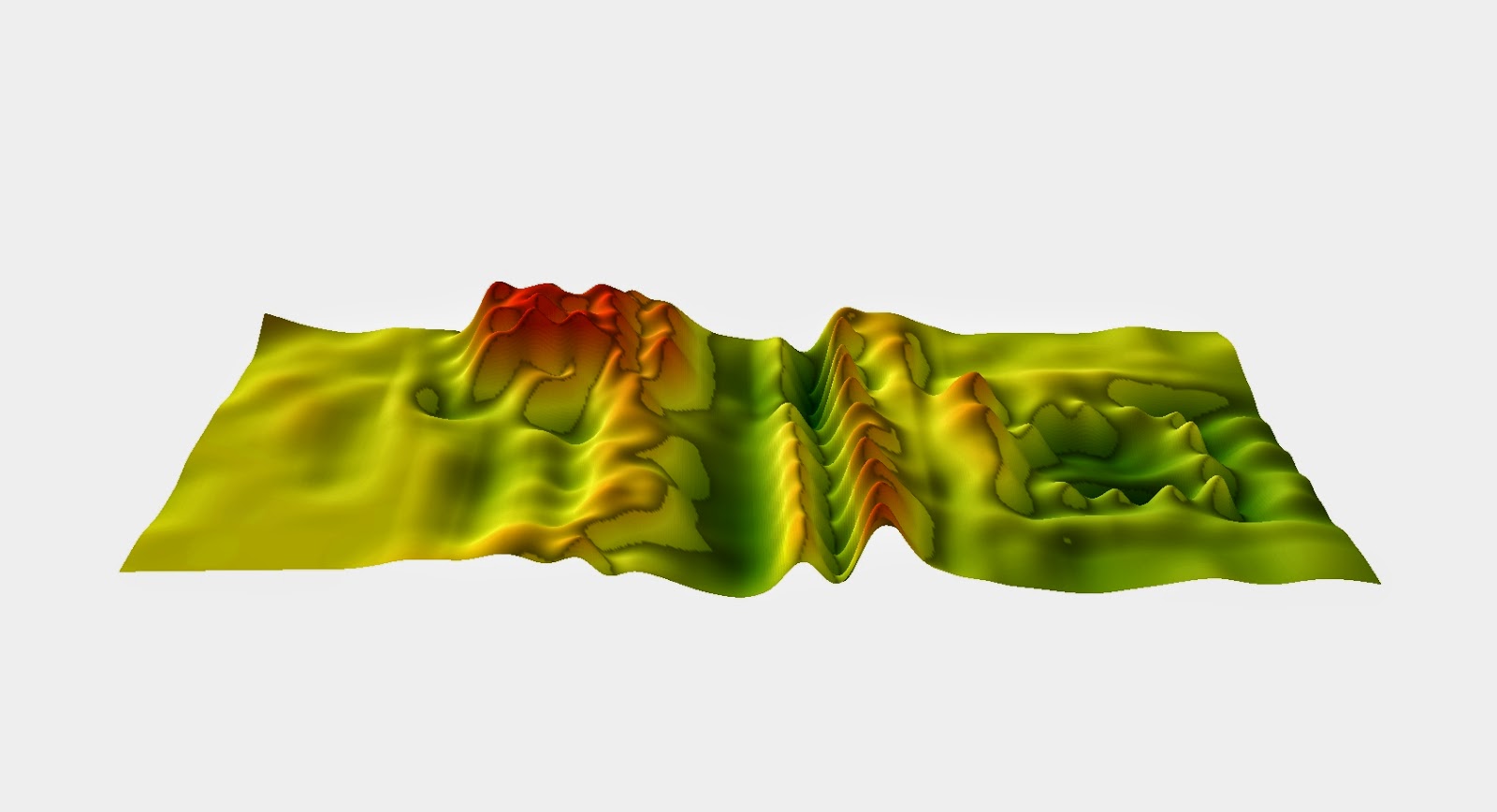 |
| 3D representation of the terrain using the Spline Method. (Figure 5b) |
A TIN or a Triangular Irregular Network is a digital way to represent a surface. They are created using a triangular set of vertices in a vector setting. The vertices are connected by edges which forms a network of triangles that covers the whole surface of the terrain. The more data points a TIN has to work with the better the resolution is and this typically happens on areas of large elevation change so ridgelines and river banks are usually represented very well in a TIN.
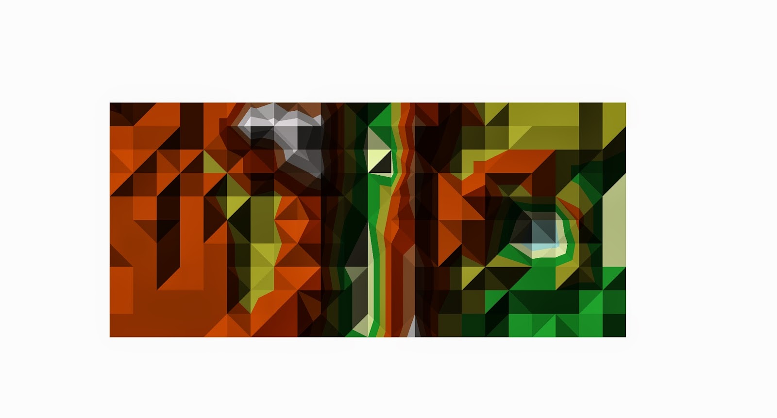 |
| 2D representation of the terrain using the TIN method. (Figure 6a) |
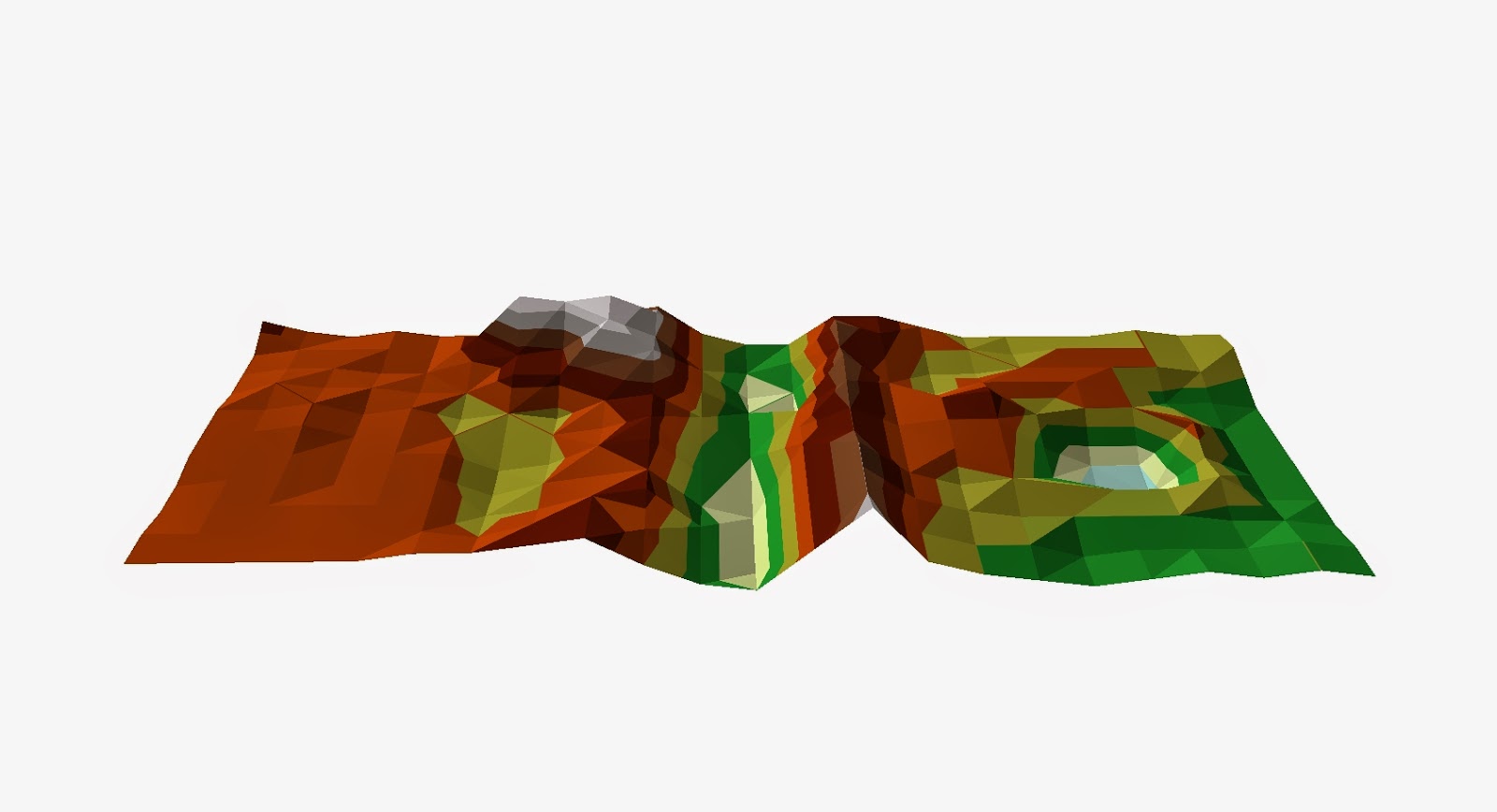 |
| 3D representation of the terrain using the TIN method. (Figure 6b) |
Overall all of these techniques did a fairly decent job of reproducing our terrain model but some obviously did it more accurately than others. After looking at all of the techniques I think it is apparent that the Kriging technique did the best reproducing our model terrain. The TIN did a pretty good job too but the small amount of data points makes the image choppy and clunky.
After looking at our results we decided as a group to go back and resample parts of our terrain to see if we could get a more accurate representation of it in ArcScene. Below is the new feature class after we collected more data points and increased our measurement frequency in areas of large elevation change like by our ridges, hill and crater.
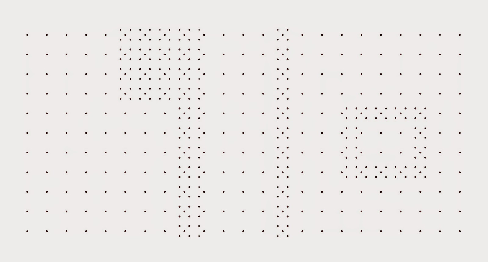 |
This is our feature class after collecting more data points. (Figure 7)
|
Discussion
Each interpolation method had strenghts and weaknesses. We were interested in the method that most accurately displayed our data. Looking at the images of each method we got the following results. The IDW did not perform well, the surface was spiky and had unrealstic features added to it. (Figure 2b) The nearest neighbor method did much better displaying the real surface however there were still some small spike especially along the top of the ridges which it made very pointed. (Figure 3b) The Kringing method did slightly better than the nearest neighbor with very little spiking and a pretty accurate representation of the real surface.(Figure 4b) The spline method did not do well with our data. There are lots of weird spike and points all over the image and compared to the real model terrain that the spline image looks nothing like it. (Figure 5b) The 3D TIN is really accurate and compared to the other methods I think it did the best representaion of the surface with the first data set. The biggest set back with the TIN is that in order to make it look smooth and not clunky we would have to redo the data for the entire terrain adding many more data points so that it would contain many more smaller triangles which would greatly improve the smoothness of the image. (Figure 6b)
Based on the above results we decided to the use the Kriging method with our second data set. Even though the TIN did a good job of representing the surface the time it would have taken to survey our model terrain with the amount of points needed for a better TIN would have been insane. So we chose the Kriging method which also very accurately modeled the surface and we could re sample small areas to get a better image instead of the whole terrain. I think that just from looking at the results of the 2D image from the first to second time after more points were added is enough to say that adding those points definitely enhanced the final image. Knowing what our model terrain looks like I can easily pick out the features in the second image where as in the first it just looks like a bunch of different color blobs. Looking at the 3D model you can see that the spikes and other unnatural features go away in the second image. The increase in data points helps to eliminate these computer errors and gives us a smooth realistic surface.
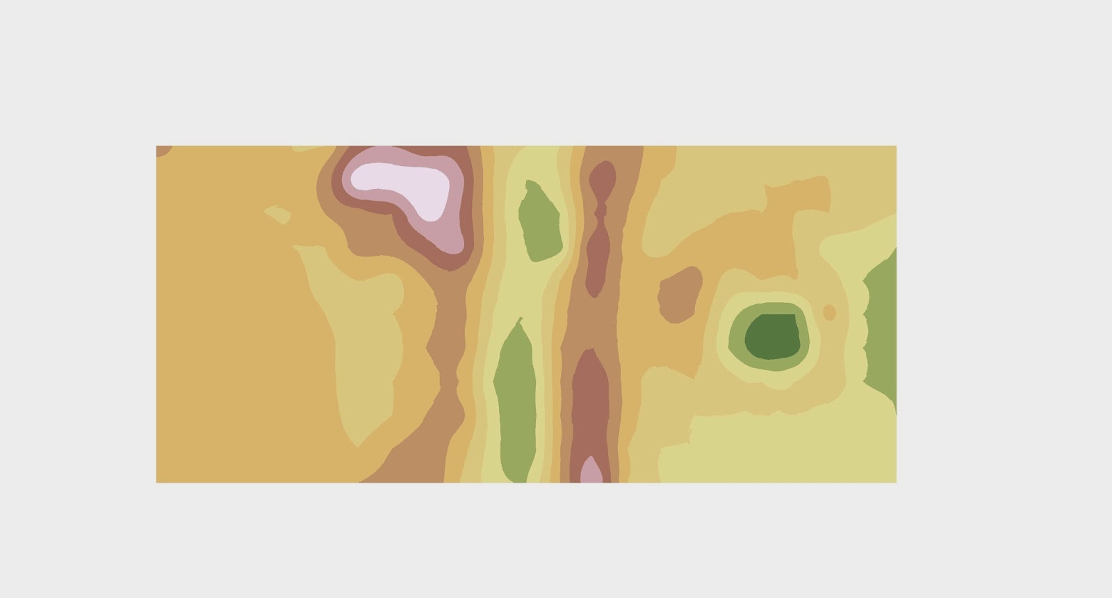 |
| Kriging method 2D image with original data points. (Figure 8a) |
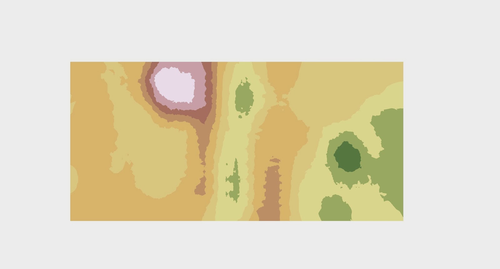 |
| Kriging method 2D image with the expanded data points. (Figure 8b) |
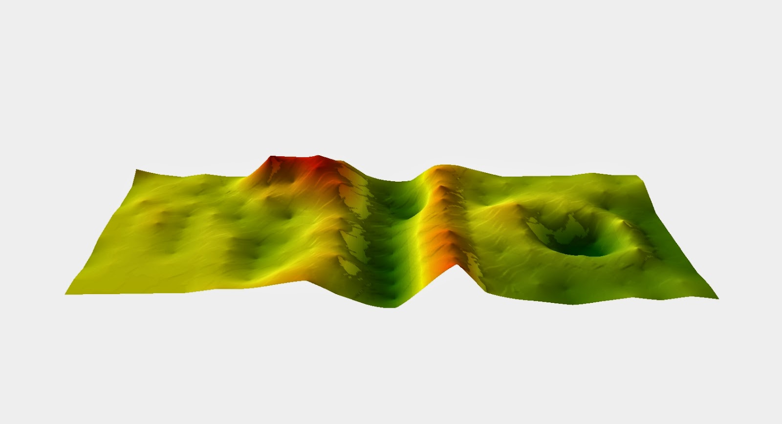 |
| Kriging method 3D image with first data points.(Figure 9a) |
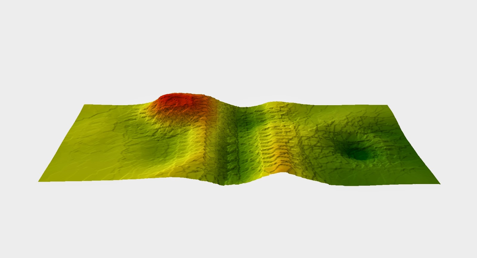 |
| Kriging method 3D image with expanded data points. (Figure 9b) |
The results of our data points in our second data set may be slightly off from the first data set because it snowed a little bit on our model terrain and the sun was also shaping the model so there were some slight differences. Next time I think making our model out of dirt instead of snow would be wise and also keeping the model covered from the elements would also help preserve the shape and give us more accurate measurements.
Conclusion
Learning different interpolation methods and hen to use them is a big take away from this activity. Having to work in a group in cold weather and hurrying to get done before it got dark and we couldn't see anything made us work together better and more quickly while still getting accurate results. This activity is very reliant on the terrain model surviving weather condition so if I did this again and I think the group would agree that we would use something other than snow to make our model out of. I think it would also be cool to survey the model through use of aerial photographs or some other survey method a little out side of the box.


No comments:
Post a Comment